Pxless: The Future of Fluid, Scalable, and Modern Digital Design
A Complete Guide to Building Adaptive, Performance-Driven, and User-Centered Interfaces Without Fixed Pixels
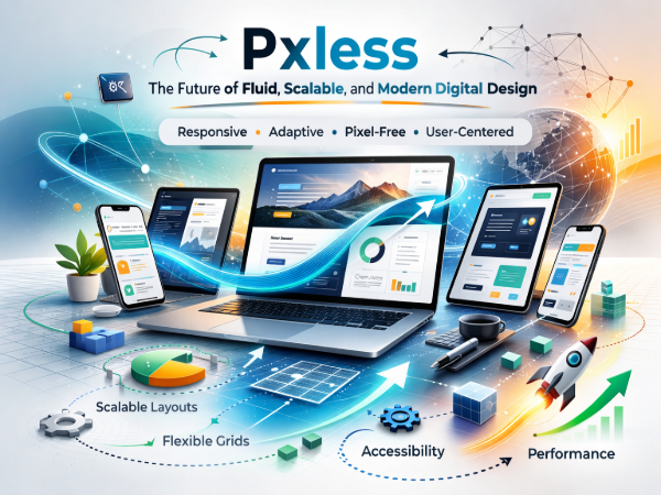
Pxless is a modern design and technology approach that reduces dependency on fixed pixel measurements and instead focuses on fluid, scalable, and adaptive layouts. By using relative units, flexible grids, and responsive systems, Pxless enables digital experiences to adjust seamlessly across devices, screen sizes, and user preferences. This approach improves usability, accessibility, performance, and long-term maintainability, making it an important evolution in web design, mobile applications, and digital product development.
Introduction to Pxless
In today’s digital world, users access websites and applications from countless devices — smartphones, tablets, laptops, desktops, smart TVs, and even wearable technology. Traditional design methods that rely heavily on fixed pixel values often struggle to adapt to this variety.
This is where Pxless comes in.
Pxless is an emerging design philosophy that minimizes the use of rigid pixel-based layouts and embraces flexibility instead. Instead of building interfaces that are locked to specific dimensions, Pxless promotes scalable systems that automatically adjust to different screen sizes, resolutions, and accessibility needs.
The result is a smoother user experience, improved performance, and future-ready digital products.
Why Pxless Matters in Modern Design
Digital expectations have changed. Users demand:
Fast-loading websites
Mobile-friendly layouts
Accessible interfaces
Clean and intuitive experiences
Consistency across devices
Pxless directly supports these expectations by creating adaptable systems rather than fixed structures.
Traditional pixel-based layouts can break when:
Screen sizes change
Users zoom in for accessibility
New devices enter the market
Content length varies
Pxless reduces these limitations by focusing on flexibility.
Core Principles of Pxless Design
Fluid Layout Systems
Pxless designs rely on fluid structures rather than rigid measurements. Layouts expand and contract naturally depending on available space.
This creates:
Better responsiveness
More balanced spacing
Consistent alignment
Improved readability
Fluid systems allow content to flow instead of forcing it into fixed containers.
Relative Units Instead of Fixed Pixels
Instead of relying heavily on fixed pixel values, Pxless encourages the use of:
Percentage-based sizing
Relative typography units
Viewport-based measurements
Flexible spacing systems
These units help elements scale proportionally across devices.
For example:
Text remains readable on large screens.
Buttons adjust naturally on mobile devices.
Layout spacing remains consistent.
Adaptive Grid Structures
Modern grid systems are essential in Pxless design. Flexible grids automatically reorganize content based on screen size.
Benefits include:
Clean alignment
Structured content flow
Better visual balance
Improved user navigation
Adaptive grids reduce the need for manual adjustments across breakpoints.
Accessibility-First Thinking
This pixel-free design approach supports accessibility by default.
When interfaces scale naturally:
Users can increase text size without breaking layouts.
Content remains readable.
Navigation stays usable.
Visual hierarchy is preserved.
This makes this adaptive design philosophy especially valuable for inclusive digital experiences.
Performance Optimization
Rigid layouts often require additional styling overrides and complex adjustments. This flexible layout system encourages cleaner structures that reduce unnecessary code complexity.
This can lead to:
Faster rendering
Reduced layout shifts
More efficient CSS
Smoother user interaction
Performance plays a crucial role in user satisfaction and search visibility.
Pixel-Free vs Traditional Pixel-Based Design
| Feature | Traditional Design | Adaptive Approach |
|---|---|---|
| Layout Type | Fixed | Fluid |
| Device Adaptability | Limited | High |
| Accessibility | Often Added Later | Built-In |
| Maintenance | Frequent Adjustments | Easier Long-Term |
| Future Compatibility | Less Flexible | More Adaptive |
| Content Scaling | Restricted | Natural |
Traditional methods focus on precise control. The fluid design approach focuses on adaptability and scalability.
How Adaptive Design Improves User Experience
User experience is the foundation of digital success.
This modern scalable system improves UX by ensuring:
Consistency Across Devices
Users receive similar quality experiences regardless of device type.
Better Readability
Text adjusts naturally to screen sizes and user preferences.
Reduced Frustration
Layouts do not break or overlap when screens change.
Smooth Navigation
Menus and components reorganize intelligently.
When design adapts to users instead of forcing users to adapt to design, engagement increases.
Flexible Design in Web Development
In web development, these principles can be implemented through:
Flexible layout systems
Responsive frameworks
Scalable typography
Adaptive spacing strategies
Dynamic component structures
Modern websites benefit greatly from this approach because it ensures compatibility with:
Mobile browsers
Tablets
Large desktop monitors
Ultra-wide screens
Search engines also favor mobile-friendly and responsive websites, making this approach valuable for visibility.
Flexible Approach in Mobile Application Design
Mobile applications must function across different screen sizes and resolutions.
This scalable interface strategy helps by:
Allowing UI components to resize automatically
Supporting different device densities
Maintaining consistent spacing
Preserving visual hierarchy
This reduces redesign effort when new devices enter the market.
Business Benefits of the Adaptive Design Model
Adopting this approach is not only a design choice — it is a strategic decision.
Long-Term Cost Efficiency
Fewer layout revisions mean reduced maintenance costs.
Faster Development Cycles
Flexible systems reduce repeated adjustments.
Improved Brand Experience
Consistent interface quality strengthens brand trust.
Future Scalability
Digital products can evolve without major structural changes.
Businesses benefit from stability and adaptability.
Common Misunderstandings About This Design Philosophy
Myth 1: Pixels Are Completely Removed
This approach does not eliminate pixels entirely. It reduces dependency on fixed values.
Myth 2: It Makes Design Less Precise
It still allows precision — but in a scalable way.
Myth 3: It Is Only for Designers
Developers, product teams, and UX professionals all benefit from these principles.
Best Practices for Implementation
To adopt this fluid design methodology successfully:
Use flexible layout systems
Prioritize scalable typography
Design with adaptability in mind
Test across multiple devices
Avoid hard-coded dimensions where possible
Focus on content-driven design
Start with a fluid foundation and refine from there.
Challenges in Moving Toward a Fluid System
Like any modern approach, this model may present challenges:
Requires mindset change
Needs structured design systems
Demands careful planning
May require team alignment
However, once implemented, the benefits outweigh the initial learning curve.
The Future of Adaptive Design
Digital technology continues to evolve rapidly.
Emerging trends such as:
Foldable devices
High-resolution displays
Variable screen sizes
Voice interfaces
Wearable technology
All require flexible systems.
This scalable design philosophy aligns naturally with these innovations by promoting adaptability rather than rigidity.
As digital experiences expand beyond traditional screens, these principles will become even more important.
Conclusion
The adaptive, fluid design approach represents a forward-thinking evolution in digital design. By reducing dependence on fixed pixel measurements and embracing scalable systems, it enables better usability, improved accessibility, and long-term sustainability.
It supports modern expectations of performance, responsiveness, and device compatibility. Whether applied in web design, mobile applications, or broader digital products, this flexible foundation helps create future-ready experiences.
As technology continues to evolve, design approaches must evolve with it. This scalable methodology provides a practical and adaptable path forward for building efficient, user-centered digital environments.